Как сделать - перевернуть изображение
Узнайте, как перевернуть изображение (добавить зеркальный эффект) с помощью CSS.
Наведите указатель мыши на изображение:
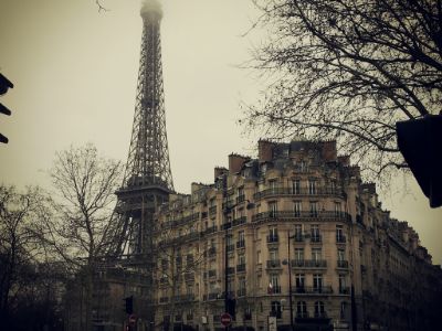
Как перевернуть изображение
Пример
<style>
img:hover {
-webkit-transform: scaleX(-1);
transform: scaleX(-1);
}
</style>
<img src="paris.jpg"
alt="Paris">
Примечание. Этот пример не работает на планшетах и мобильных телефонах.
Совет: перейдите к нашему учебному пособию по 3D-преобразованиям CSS , чтобы узнать больше о 3D-преобразованиях.
3D-переворот изображения с текстом
Узнайте, как сделать анимированный 3D-флип изображения с текстом:
Париж
Какой удивительный город
Шаг 1) Добавьте HTML:
Пример
<div class="flip-box">
<div class="flip-box-inner">
<div class="flip-box-front">
<img src="img_paris.jpg"
alt="Paris" style="width:300px;height:200px">
</div>
<div
class="flip-box-back">
<h2>Paris</h2>
<p>What an amazing city</p>
</div>
</div>
</div>
Шаг 2) Добавьте CSS:
Пример
/* The flip box container - set the width and height to whatever you want. We
have added the border property to demonstrate that the flip itself goes out of
the box on hover (remove perspective if you don't want the 3D effect */
.flip-box {
background-color: transparent;
width: 300px;
height: 200px;
border: 1px solid #f1f1f1;
perspective:
1000px; /* Remove this if you don't want the 3D effect */
}
/* This
container is needed to position the front and back side */
.flip-box-inner {
position: relative;
width: 100%;
height: 100%;
text-align: center;
transition: transform
0.8s;
transform-style: preserve-3d;
}
/* Do an horizontal
flip when you move the mouse over the flip box container */
.flip-box:hover .flip-box-inner {
transform: rotateY(180deg);
}
/* Position the front and back side */
.flip-box-front, .flip-box-back {
position: absolute;
width: 100%;
height: 100%;
-webkit-backface-visibility: hidden; /* Safari */
backface-visibility: hidden;
}
/* Style the front side (fallback if
image is missing) */
.flip-box-front {
background-color: #bbb;
color: black;
}
/* Style the back side */
.flip-box-back {
background-color: dodgerblue;
color: white;
transform: rotateY(180deg);
}